
vice president of strategy and communications,
Christian Living Communities
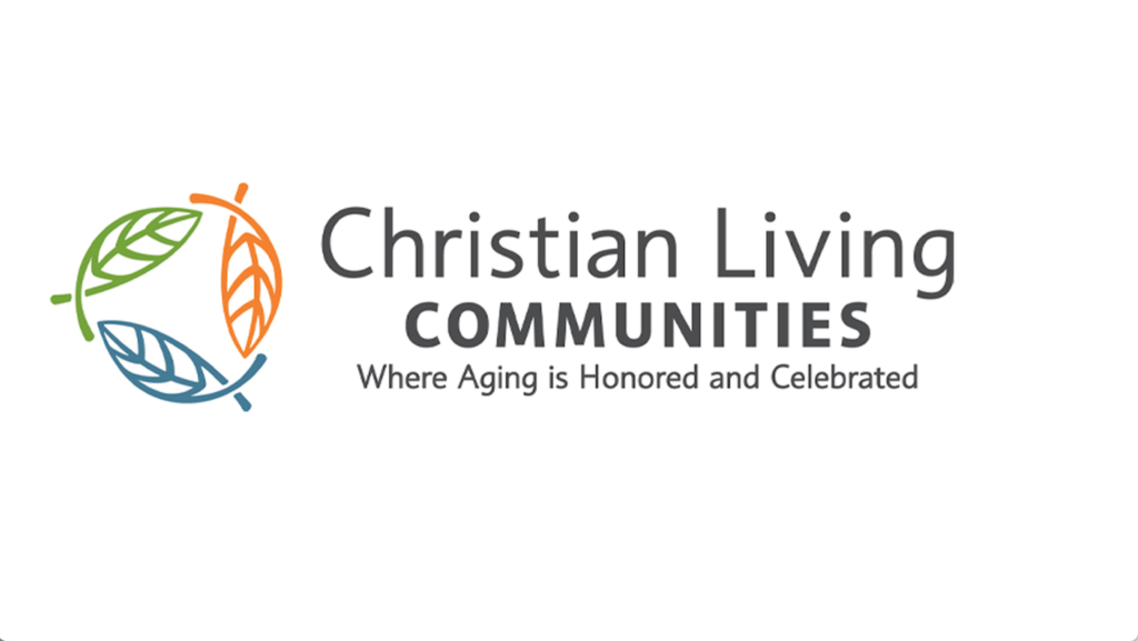
Denver-based Christian Living Communities is celebrating its 50th anniversary with the rollout of a new logo and tagline.
The previous logo was introduced 17 years ago and “had become dated in look at color,” Pam Sullivan, vice president of strategy and communications, told the McKnight’s Business Daily. “We felt like we wanted to look fresher, be more vibrant, because CLC is a very vibrant organization.”
Many branding experts recommend a logo refresh every 10 to 15 years, the company said in a press release, and the organization’s golden jubilee seemed like the ideal time for a refresh. The purple and copper lilies logo introduced in 2005 symbolized love and life, and organization leaders wanted a new look to reflect changes that have happened over time, such as the addition of new communities, employees and services.
The new brand image affects Christian Living Communities’ six organizational brands. The other six communities that the company manages are called Neighborhoods of Christian Living. The company operates in Colorado, Indiana and Ohio.
“We very strategically do not call our communities by our corporate name. They each have their own name brand that is not related to our parent company,” said Sullivan, who has worked for CLC for 18 years.

The new logo can be seen as fishes or leaves, depending on the viewer’s perspective, according to the company. A fish s a traditional symbol of Christianity and could be seen as conveying that CLC is a faith-based organization, Sullivan said, whereas a leaf is a symbol of life or growth.
“This new look embraces what Christian Living Communities is all about and will help us as we move forward with a renewed commitment to creating communities where aging is honored and celebrated,” CLC President and CEO Jill Vitale-Aussem said in a press release issued this week.
The previous colors were “pretty dignified and muted,” Sullivan said, so the organization decided to move toward more vibrant colors. The new blue, green and orange colors are meant to represent stability, growth, harmony, enthusiasm, health and happiness.
The new tagline, Where Aging is Honored and Celebrated, goes to the heart of the organization’s values, Sullivan said.


